peteypan wrote:I honestly think they all look great

so excited to play the patch lol
Thank you a lot!

megyaem30 wrote:I agree with nigogu in this court, is inclined in the upper part of the court, looks like the court is a little sink in the floor, maybe you can fixed this one? others one looks good, specially Dothan

I can try
But if you think that court is like on the floor (in comparation to the other court on the left) it is because it is (upper to the other court). But on camera, I think line really follows edge line of the court so honestly I'm not sure what to do cause I think it is ok. In comparation, I just realized Kurume court is awful so I will correct it's camera actually.
miharu0607 wrote:The only thing I would change with Seville is surface. You can't tell what exactly surface it is.
It's hard to change it on a preview with players, scoreboard, but the difference is visible.
I know about surface. Still, I have one problem. I'm very beginner in photoshop and I'm afraid I do not have skill to do this (can you suggest some useful tutorials maybe??). But on the other side, this is clay from real tournament and I think it is nice to have differences. Also, it is 25k challenger so I think it is ok...

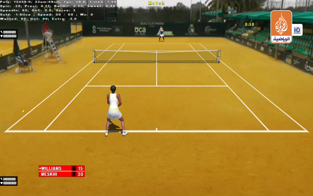
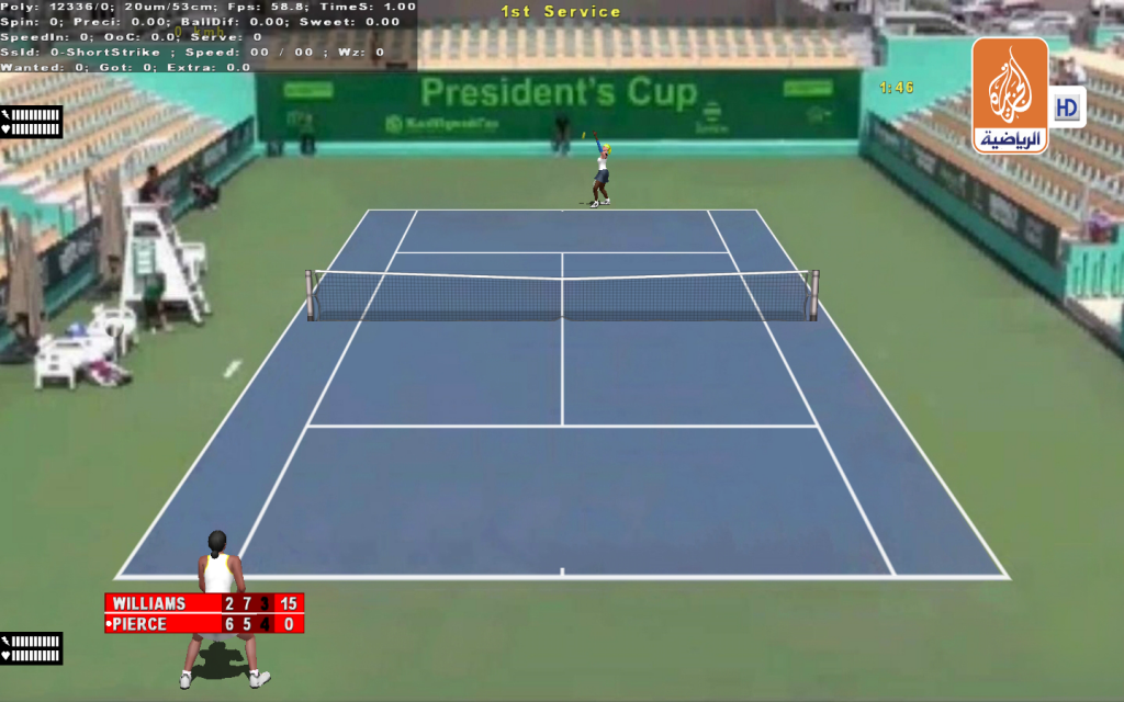
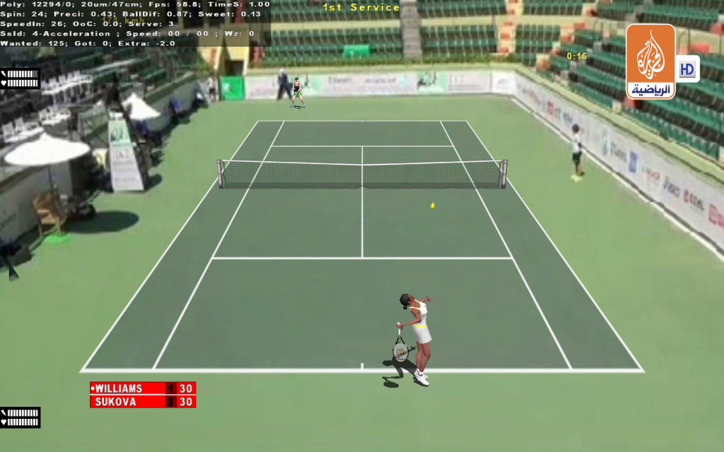
Some previews here:


 And Loughborough has similar camera...


 )
)