Tennis Elbow 2014 LOGO

General discussions about the 3rd edition of Tennis Elbow

Re: Tennis Elbow 2014 LOGO

Postby Nigogu » 26 Feb 2014, 17:50

Amazing video kristooph :applause: , even better previews than heinrich, hope you can do something before TE4 (that won't be released in the soon future :cry: )
User avatar
Nigogu
crazy of the little yellow ball
 
Messages: 3562
Gaming Since: 26 Mar 2012, 16:48

Re: Tennis Elbow 2014 LOGO

Postby kristooph » 26 Feb 2014, 18:46

Oh i will be happy if i can help to improve it before, i dont know maybe te 2013 1.0d

But i dont know is that possible to make in it, abot colors - i will show cold version.
Definately i have to improve icons which i made.

Manatoo - is that possible to put changes like that in 2013 version?
User avatar
kristooph
crazy of the little yellow ball
 
Messages: 89
Gaming Since: 09 Feb 2014, 03:45
Location: Poland

Re: Tennis Elbow 2014 LOGO

Postby Nigogu » 26 Feb 2014, 19:32

I'm sure he can do it (another thing if he don't wants to :fear: ), and he should do it, if the rumors are true (TE4 not coming before 2016).
Regards :jap:
User avatar
Nigogu
crazy of the little yellow ball
 
Messages: 3562
Gaming Since: 26 Mar 2012, 16:48

Re: Tennis Elbow 2014 LOGO

Postby kristooph » 27 Feb 2014, 00:09

So i prepared "cold colors" version, and change a little bit positioning.

What about that one?

I will be happy if anyone who looks at that comment what in own opinion should be improved - it helps to create sth better i think;)

COLD.jpg
COLD.jpg (65.87 KiB) Viewed 5480 times
Last edited by kristooph on 27 Feb 2014, 01:05, edited 2 times in total.
User avatar
kristooph
crazy of the little yellow ball
 
Messages: 89
Gaming Since: 09 Feb 2014, 03:45
Location: Poland

Re: Tennis Elbow 2014 LOGO

Postby Marcos Nion » 27 Feb 2014, 00:28

This is awesome, I like the colors in this "cold version" and the surface choice icons, really looks like a tennis game... 10/10 ... :applause:

P.S: Manutoo can easily make a "menu change" option, or use a tool. I play Phase Shift (A rhythm game) and there you can change the "themes" into whatever you want (there are even Guitar Hero themes :wink: ) ... Good luck friend... :jap:
User avatar
Marcos Nion
crazy of the little yellow ball
 
Messages: 506
Gaming Since: 28 Jan 2012, 07:42
Location: Brazil

Re: Tennis Elbow 2014 LOGO

Postby Nigogu » 27 Feb 2014, 01:53

kristooph,
Are this designs or captures in-game :fear: :?:
User avatar
Nigogu
crazy of the little yellow ball
 
Messages: 3562
Gaming Since: 26 Mar 2012, 16:48

Re: Tennis Elbow 2014 LOGO

Postby kristooph » 27 Feb 2014, 02:00

hmmm, you ask is that just drowing or i have already a game with changings like that?
thats just projects:)

Sorry if i understood that bad way:)
User avatar
kristooph
crazy of the little yellow ball
 
Messages: 89
Gaming Since: 09 Feb 2014, 03:45
Location: Poland

Re: Tennis Elbow 2014 LOGO

Postby Nigogu » 27 Feb 2014, 03:18

kristooph,
No prob, just asking coz if it's real game, damn, it looks really nice :yes:
User avatar
Nigogu
crazy of the little yellow ball
 
Messages: 3562
Gaming Since: 26 Mar 2012, 16:48

Re: Tennis Elbow 2014 LOGO

Postby kristooph » 27 Feb 2014, 03:24

What I try to do is to make it pretty using simple polygons, a little bit like metro in Windows.
User avatar
kristooph
crazy of the little yellow ball
 
Messages: 89
Gaming Since: 09 Feb 2014, 03:45
Location: Poland

Re: Tennis Elbow 2014 LOGO

Postby kristooph » 28 Feb 2014, 02:58

I prepare some propositions for TE 2013 1.0d if it/s possible of course, (will be happy if it is).

Logo.jpg
Logo.jpg (17.64 KiB) Viewed 5436 times


First menu.jpg
First menu.jpg (57.32 KiB) Viewed 5436 times


SOUND.jpg
SOUND.jpg (59.09 KiB) Viewed 5436 times


And longer proposition of working game:

User avatar
kristooph
crazy of the little yellow ball
 
Messages: 89
Gaming Since: 09 Feb 2014, 03:45
Location: Poland

Re: Tennis Elbow 2014 LOGO

Postby Nigogu » 28 Feb 2014, 03:30

kristooph wrote:

This simple & minimalist design is great congrats man :applause:
It would be really good if manutoo can add this as a choosable design and other people could create more & switch them in-game (i would choose your design, kristooph :yes: )
User avatar
Nigogu
crazy of the little yellow ball
 
Messages: 3562
Gaming Since: 26 Mar 2012, 16:48

Re: Tennis Elbow 2014 LOGO

Postby kristooph » 28 Feb 2014, 03:46

Unfortunately i wrote to manatoo 2 masages and he didnt answer me ;(.
User avatar
kristooph
crazy of the little yellow ball
 
Messages: 89
Gaming Since: 09 Feb 2014, 03:45
Location: Poland

Re: Tennis Elbow 2014 LOGO

Postby manutoo » 28 Feb 2014, 04:54

kristooph,
I got busy yesterday, so I didn't have time nor energy to answer you in details... ;)

I won't do new menus for TE2013, but TE4 (and TEM2) will get new menus for sure.

If possible, I'd like to see your TE4 logo without waves on its circle (ie: it should be a perfect, or almost perfect, circle) ; it still could have waves in its texture within the circle, though.
TE2013 green version logo works well color wise, I think.

Your menu style looks clean, but as you said, it looks too much like Metro, which is an OS style, and doesn't fit much for a game, I think (although opinions might diverge on this ;) ).

I tried to look what I have in mind for TEM2/TE4, but could find any close match... I guess it would be a mix of that :
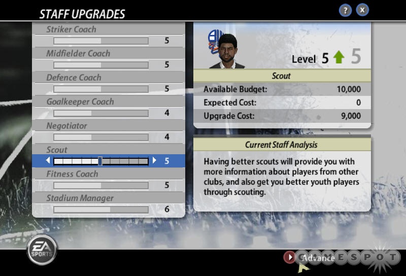
Image
& that :
Image
with current TE menus ; ie: style heavily icon based, unlike most game menus nowadays which are text based. Jury is still out, though, so I may change my mind later on... :aureola:

Nigogu,
TE Menu system allows for some light skinning, but nothing too deep, and there are 222 icons (plus a few buttons & backgrounds), so creating a new skin for it is not a piece of cake... :whistle:
ManuTOO
== Mana Games ==

>> I don't answer Private Message, except if it's really a _Private_ topic <<
User avatar
manutoo
Game Author
 
Messages: 18741
Gaming Since: 24 Jan 2004, 15:38
Location: France

Re: Tennis Elbow 2014 LOGO

Postby Nigogu » 28 Feb 2014, 05:41

manutoo,
But if you already did it, you can do it again, it would be a little gift for all the current TE players :blackeye:
Btw, PLEASE: don't come with excuses, i know you weren't going to do that, but don't tell us ''it's not a piece of cake'', just say no ;)
User avatar
Nigogu
crazy of the little yellow ball
 
Messages: 3562
Gaming Since: 26 Mar 2012, 16:48

Re: Tennis Elbow 2014 LOGO

Postby kristooph » 28 Feb 2014, 14:49

For Manutoo ;(

Hmmmm, I wanna ask abuot something - why is that a problem "creating 222 icons" if i can do it for You and that is entertainment for me.
You just can let me to do it, and I will do everything what You need in graphic (btw there is no need to create 222 icons, a lot of them are not needed).

I know that my examples are far away from perfection - but there are just done in some hours - not too much work on it. There are clean and simple cause this is a main idea, which can be improved and get more complicated parts.

Of course i know, that i shouldn't critisizing your examples, cause you have last decision, and you will probably just tell me no, if i wouldn't complately agree with your words.

I do not see difference between OS, games, cartoons, clothes or cars in this topic - the one thing which is needed for all of them is to be pleasure to the eye for the first look of course, not for always.

You can see that every player here who saw and commented that - even if its simple - say that it's good - so people like it. I thing when people see something and when it is not pretty for first look they almost always do not want to pay their attention for that any minutes longer. I get some super kind massages from many players.

You created extremaly good game, better than virtua tennis, then top spin or grand slam tennis, for people who like tennis there is no doubt, that Your TE is one of the best or even the best tennis game created anytime, but these worse games have good first impression which causes that people who want to buy tennis game choose mainly them. The thing that they are dissapointed after some hours of playing is another thing.

The promotion which SEGA or EA put in for example in Virtua Tennis 4 was not too big. So that is not a big problem with commercial. Good computer games doesn't need super big commercial.

Your game have a SUPER potential to conquer a tennis game market, but visually: menus, icons, fonds, backgrouds, it have to be better, have to have sober look generally.

I just offer You help, which cost You nothing, You just can try to change it and see how people react for that.

Every profits You maybe get are Yours, so please try, I just wanna help to improve it, want to do 200 icons or bacgrounds or whatever just for You and TE.

I hope You will understand my massage and wouldn't think that i am arguing with You.

PS. Please answer are You interested to put any changes which I will created in TE 2013. I will be grateful for that.
Last edited by kristooph on 28 Feb 2014, 18:28, edited 1 time in total.
User avatar
kristooph
crazy of the little yellow ball
 
Messages: 89
Gaming Since: 09 Feb 2014, 03:45
Location: Poland

PreviousNext

Return to Tennis Elbow 2013

Who is online

Users browsing this forum: No registered users and 3 guests